Portfolio
Design school
Storage
About me
LinkedIn
Facebook
Instagram
zoia.bilash@gmail.com
Commercial projects
I'm Zoia Bilash, designer. I make websites. Do prototyping, design, html/css layout.
I'll tell and show you. What we discuss with client before project starts. How and why I use prototypes. How I make decisions about structure and design of website. How finalization and approval with client goes.
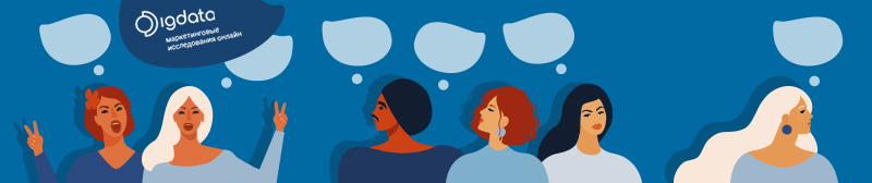
Digdata
Area of responsibility. Design solutions for the company's communication tasks:
-
— redesign of the B2b website;
-
— design of marketing materials, presentations;
-
— design code to put together analytical reports of the company;
-
— merch design (hoodies, bags as a gift to employees for the company's birthday and New Year);
- — design of a web application for conducting reports, logo redesign, mailout design, online questionnaire design, social media design, custom questionnaires, reports, presentations, banners.
About company. Digdata conducts researches of consumer behavior in the Ukrainian and foreign markets. It helps companies to study the market, find out the habits and preferences of consumers, evaluate the effectiveness of an advertising campaign.
B2b website redesign
Objectives. Refresh company's image. Make the site reflect the high status of the company. Attract new customers. Help prospective clients learn more about the company.
Solution. Updated the website design. Structured information about the company in such a way that the visitor would immediately find answers to key questions: what the company does, what problems it helps to solve. Conducted initial SEO analysis, found popular search words and phrases. Used them to tell more about the company's services. Made a Russian-language, English-language, Ukrainian-language versions of the site. As a result, the site traffic has increased more than 1.5 times, people spend more time on the website.
Disadvantages of the old company website: outdated design, complex text, illogical accents.
- - The first screen is used ineffectively. The slider is not informative, it is inconvenient to press small toggle points.
- - The text about the company is difficult to read, too long lines and small print make it difficult to read.
- - The text is uninformative, common phrases do not help the visitor to learn more about the company and make an informed decision about cooperation.
- - The text on the page is poorly structured: headings and subheadings do not help to understand the content.
- - The advantages of the company are hidden behind the buttons, which makes it difficult for the visitor to access them.
- - The logos of partners are not brought to a single scale, also hidden behind the arrows.
- - The accents are placed illogically. Random sections are highlighted in color, there are not enough accents for the CTA buttons.
- — The style, colors and fonts look outdated.
- — The site is available only in Ukrainian.
The advantages of the new page: expressive design, structured text, logical accents.
- - The first screen is expressive. It is clear what the company is doing, how it can be useful to a prospective client.
- - The text is easy to read. Headings and subheadings help to navigate the page.
- - The text is well structured, each screen answers key question about the company: who we are, what tasks we solve, how we work.
- - Portraits and brief information about the team increases the credibility of the company.
- - Accents on the page are used logically and consistently: key sections, facts, buttons are highlighted in contrasting colors.
- - Important information is not hidden behind clicks.
- - Information on the site is available in Russian, Ukrainian, English languages.

On the left is the old site design. The style is outdated, the text is difficult to read and understand, the accents are random. On the right is the new site. I updated the design, structured the text, and added accents.
Marketing materials design
Problem. The company's old marketing materials had a number of flaws. The information was presented unsystematically, common phrases did not help to understand the essence of the proposal and make an informed decision about cooperation, the accents were placed randomly, the style of presentations was outdated.
Solution. Updated presentation design. Defined the pupose of the presentation: to help a prospective client learn more about the capabilities and advantages of the company. To make the story about the company's services more visually compelling I used illustrations, transitive headings, factoids.
Omnibus Digdata presentation
Online Panel Digdata presentation

On the left is the old design. The stylistics are outdated, the solid background makes it difficult to read, common phrases do not help to understand the meaning of what is written. On the right is the new design. Illustrations, transitive headings, factoids help to quickly grasp the main point
Design code
Objective. Based on the results of the research, the analyst generates an analytical report for the customer. Often the analyst focuses more on the content of the report and thinks less about the visual component. If the company does not have uniform standards for preparing analytical reports, reports look unpredictable.
Solution. Developed uniform standards for the preparation of analytical reports. Provided instructions on how to design slides, set a modular grid, picked up colors and fonts.
Design code for the preparation of analytical reports of the company
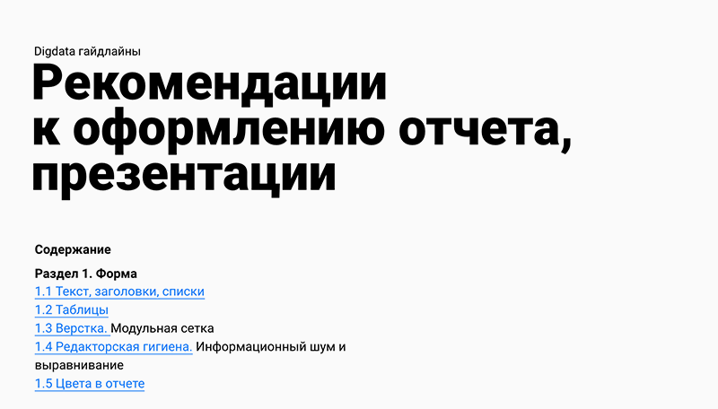
In the Guidelines I explain how to style text, tables, how to use a modular grid and corporate colors
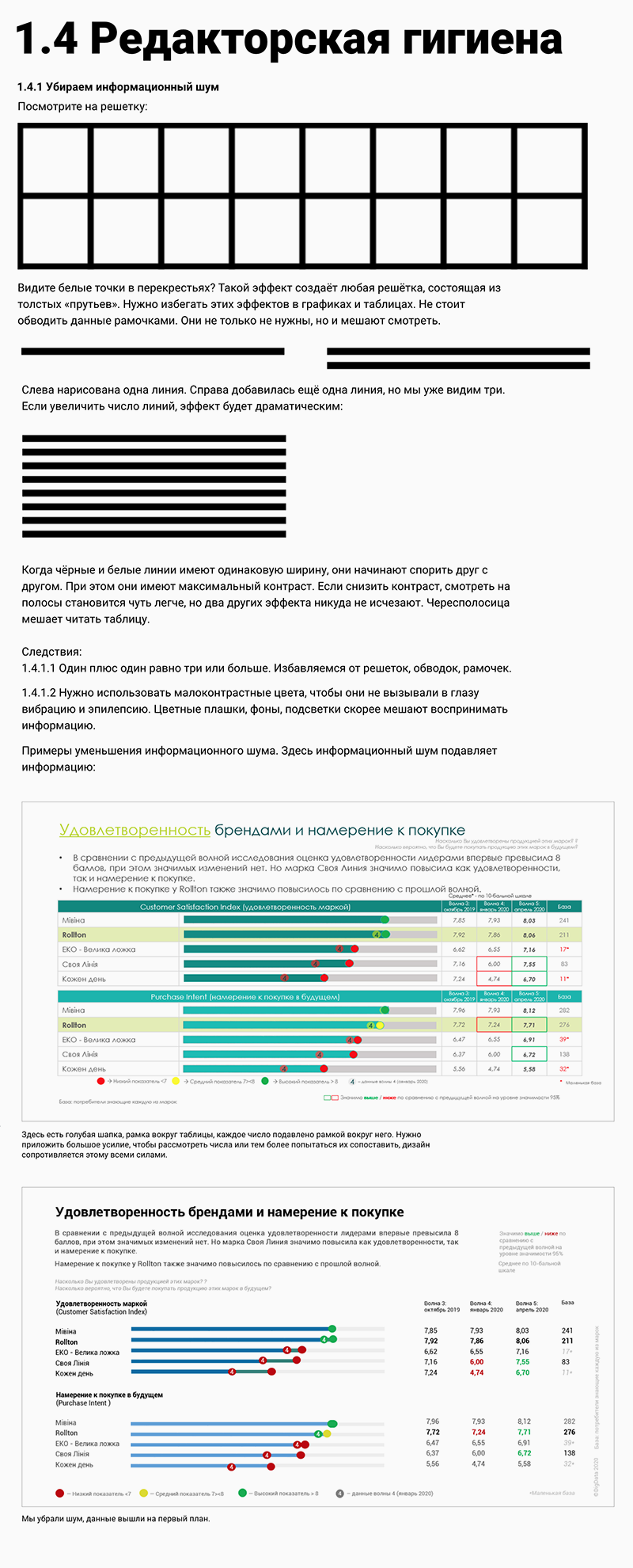
Fragment of a lecture on editorial hygiene. Explain how to get rid of information noise and make slides more expressive
Merch design
Objective. We wanted to prepare something special for the company's employees as a present for the company's birthday.
Solution. We considered different options, including the classic ones: cups, T-shirts with the company logo and symbols. But it seemed that we better come up with something special. I offered to make a unique gift for everyone: I drew vector portraits of employees, ordered a print on a hoodie. What it looked like:
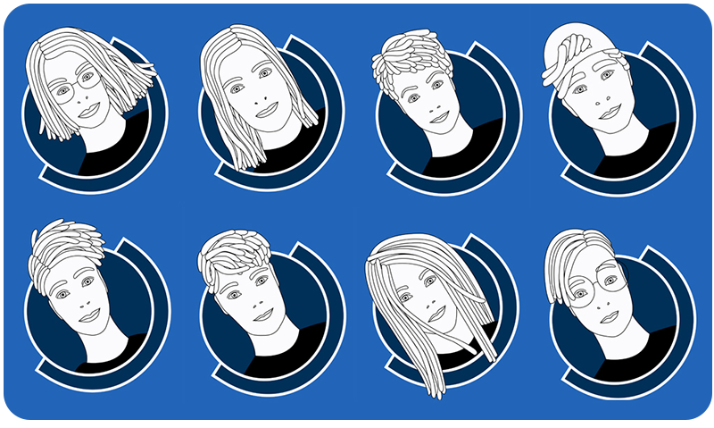
As a present for the company's birthday, I painted vector portraits of company employees
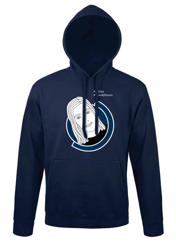
Printed portrait hoodie mockup
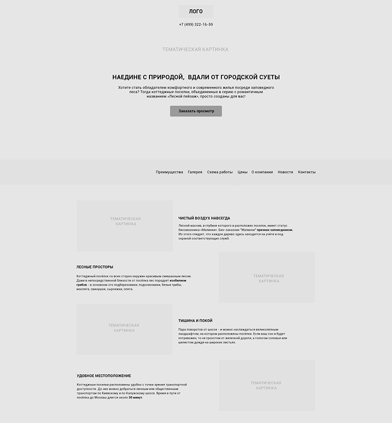
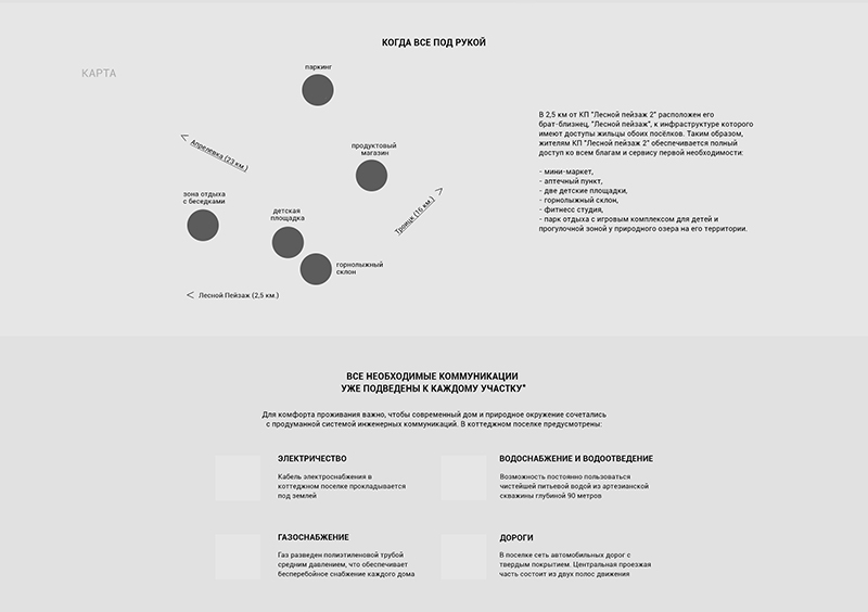
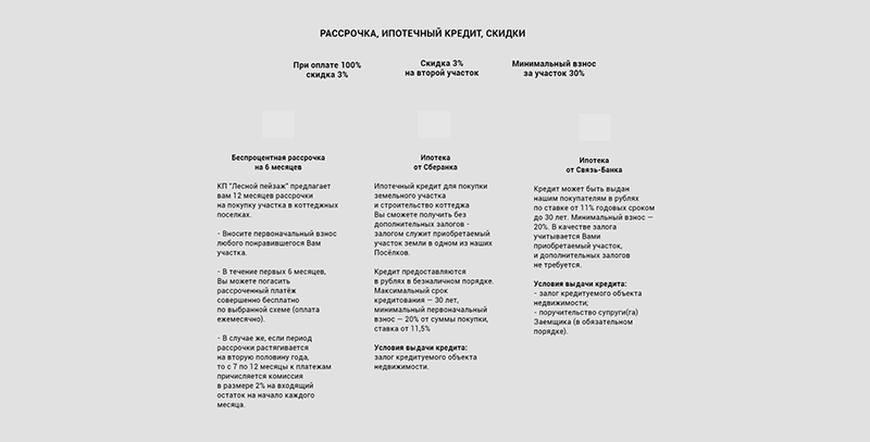
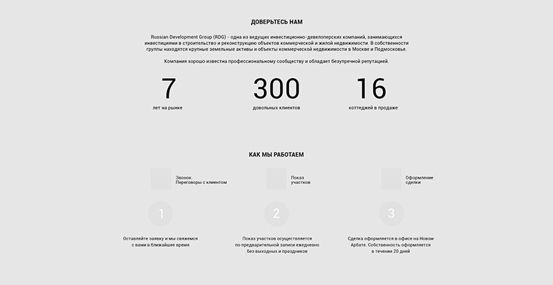
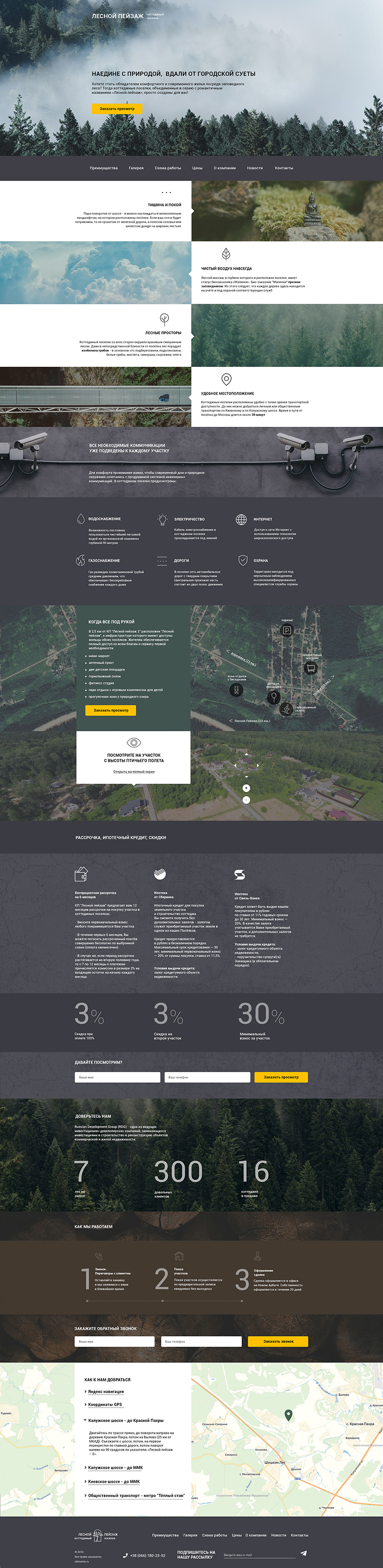
Townhouse village "Forest Landscape"

Objective. Present company's products and services and build trustful relations with potential cliets.
About company. The company sale land in the Moscow region and constructs houses and cottage settlements.

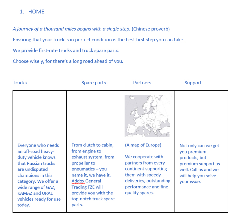
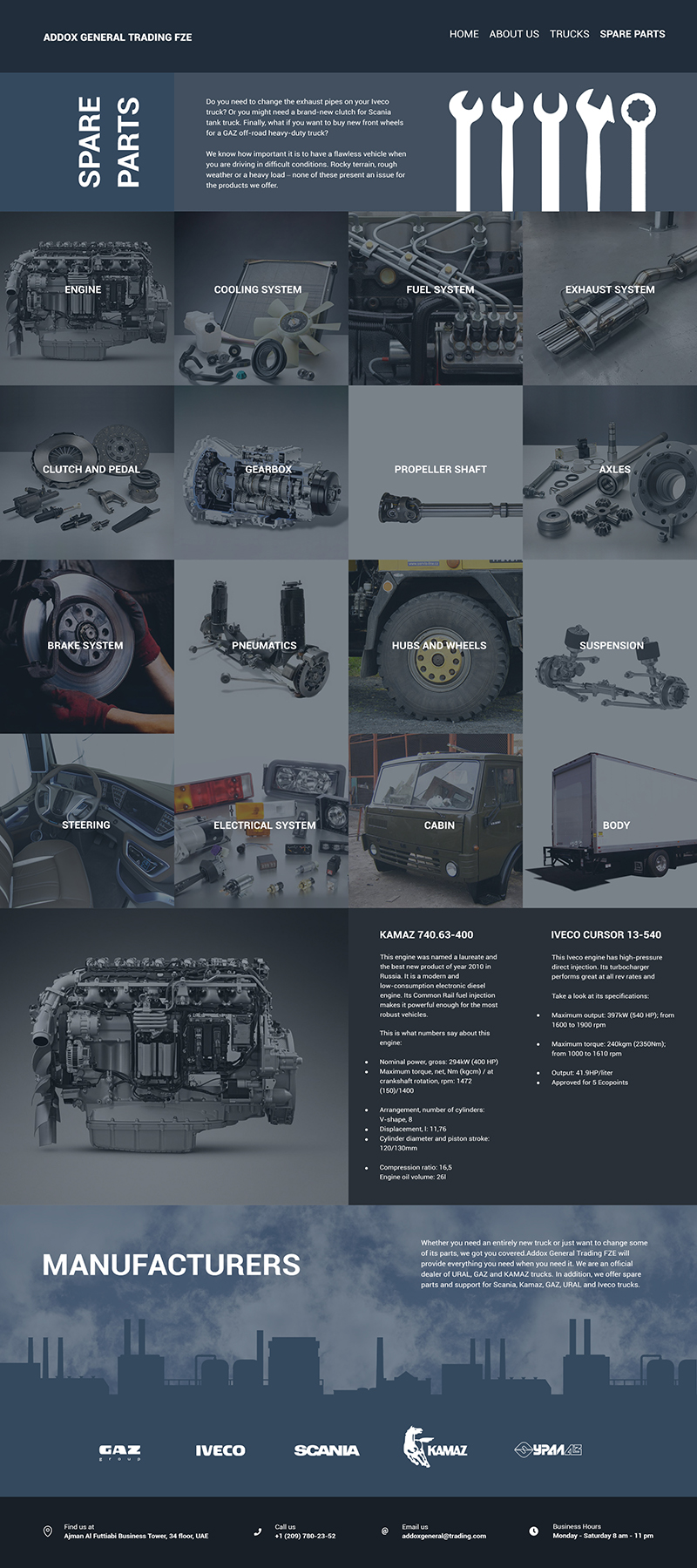
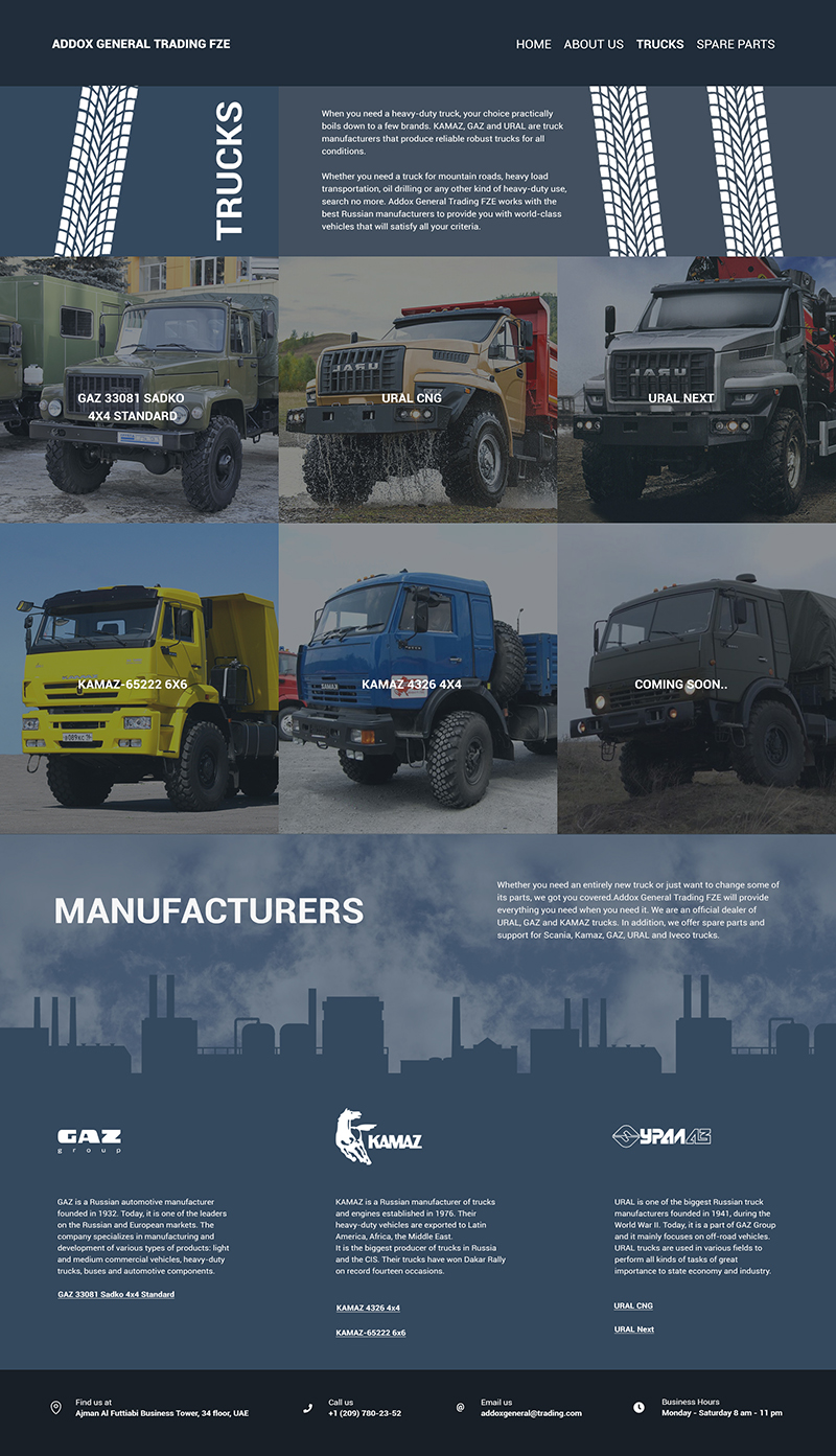
Addox General Trading FZE

Objective. Help prospective clients to know more about company's services and products.
About company. The company supplies trucks and spare parts for trucks.


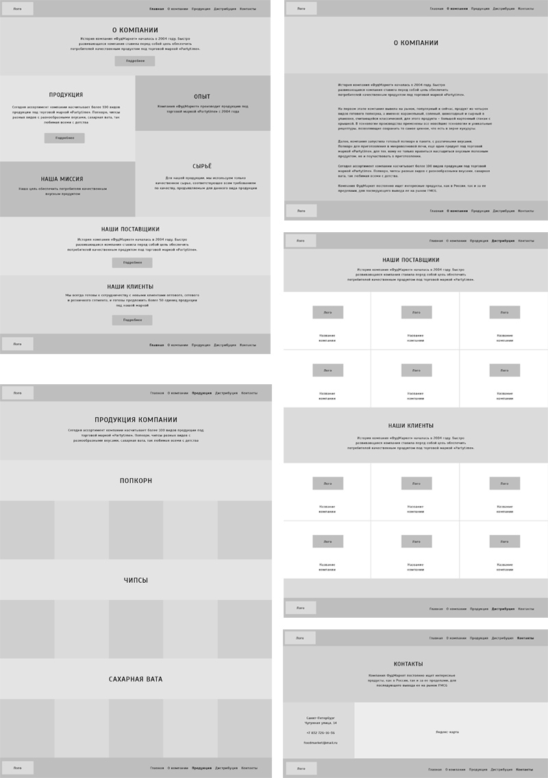
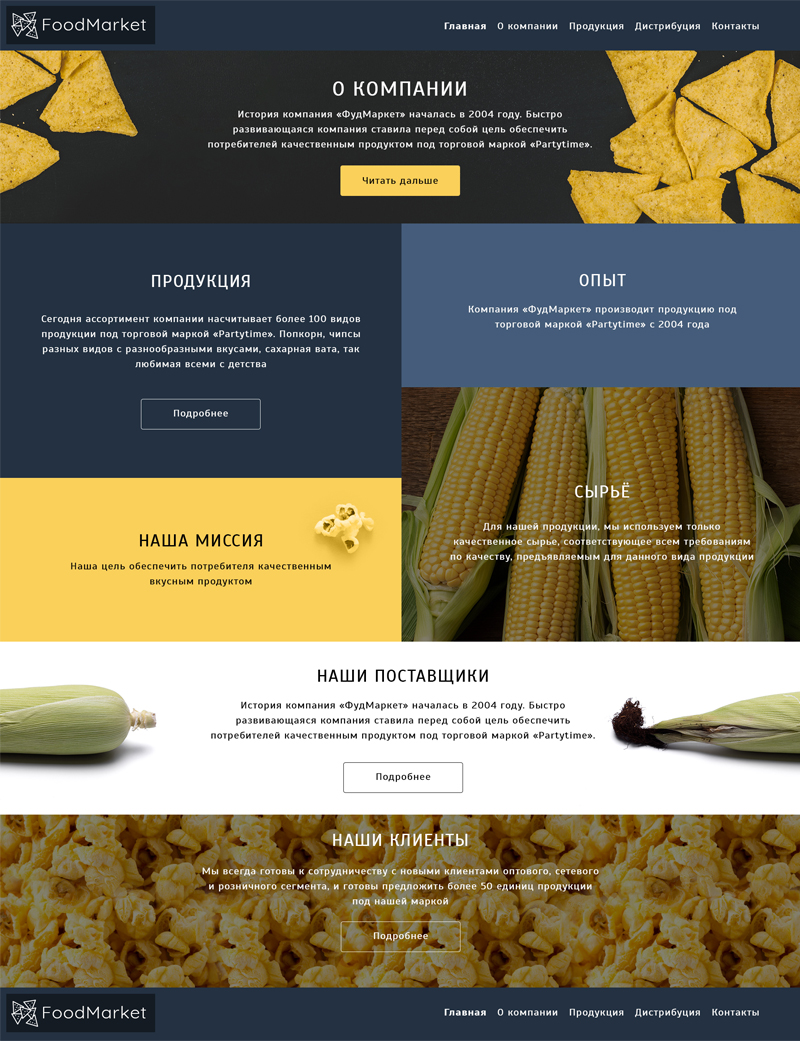
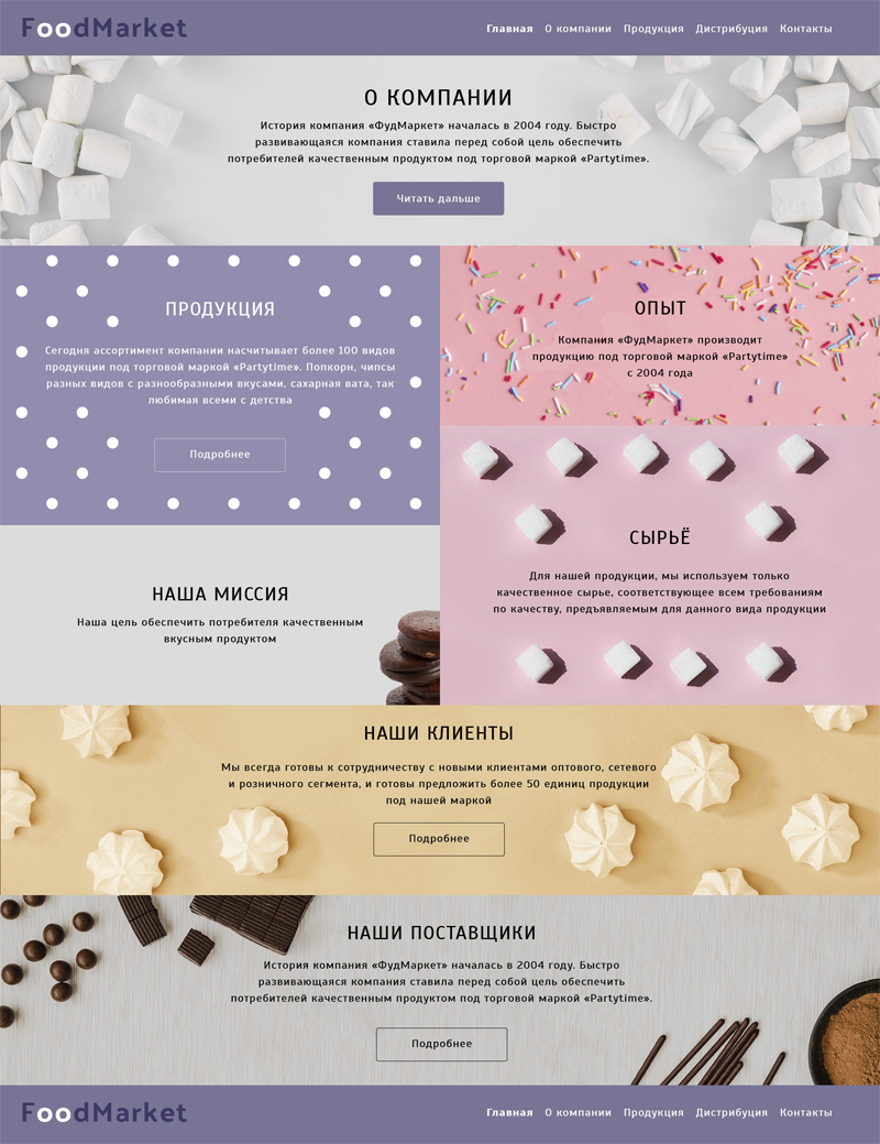
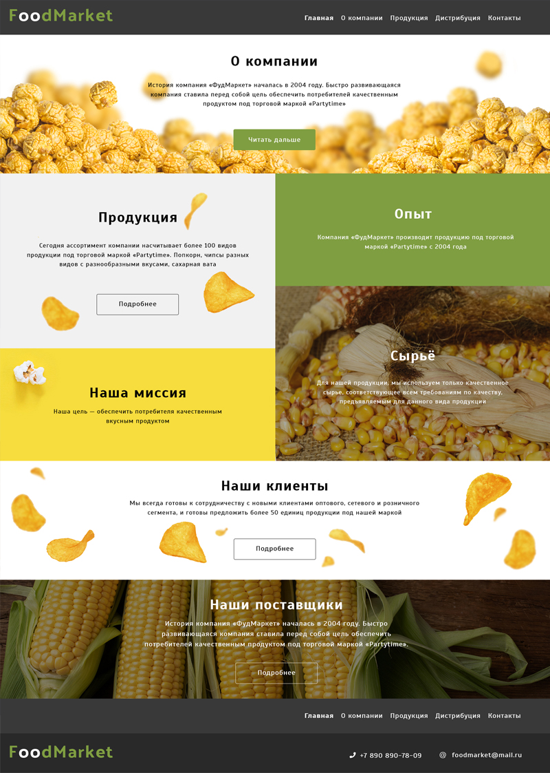
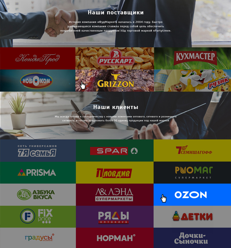
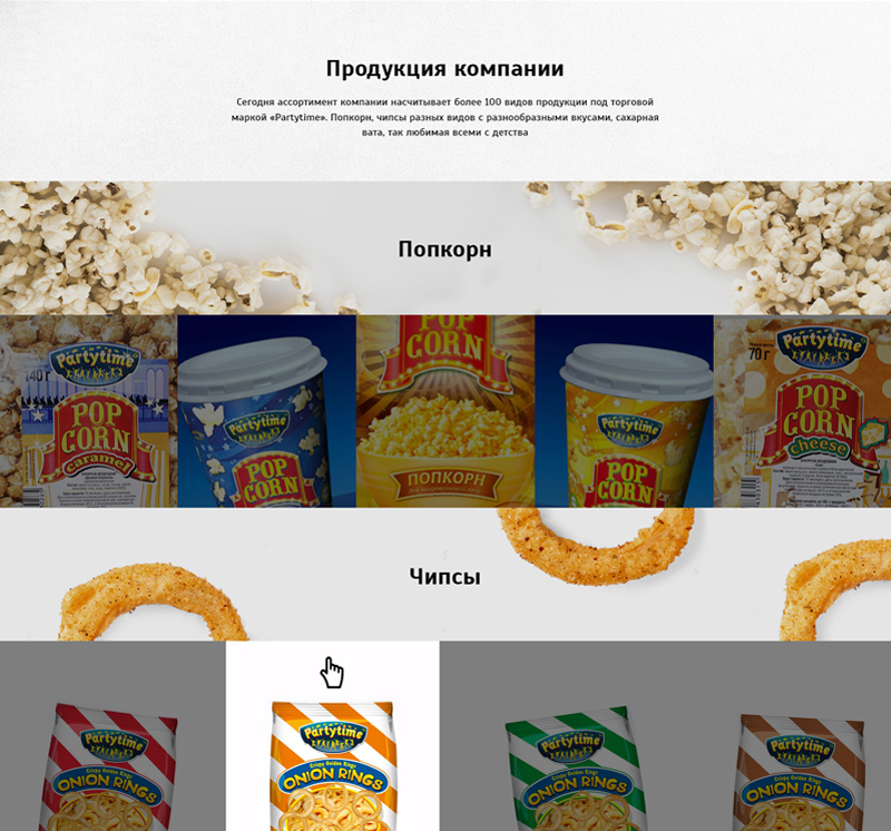
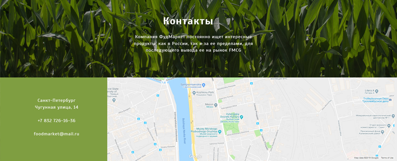
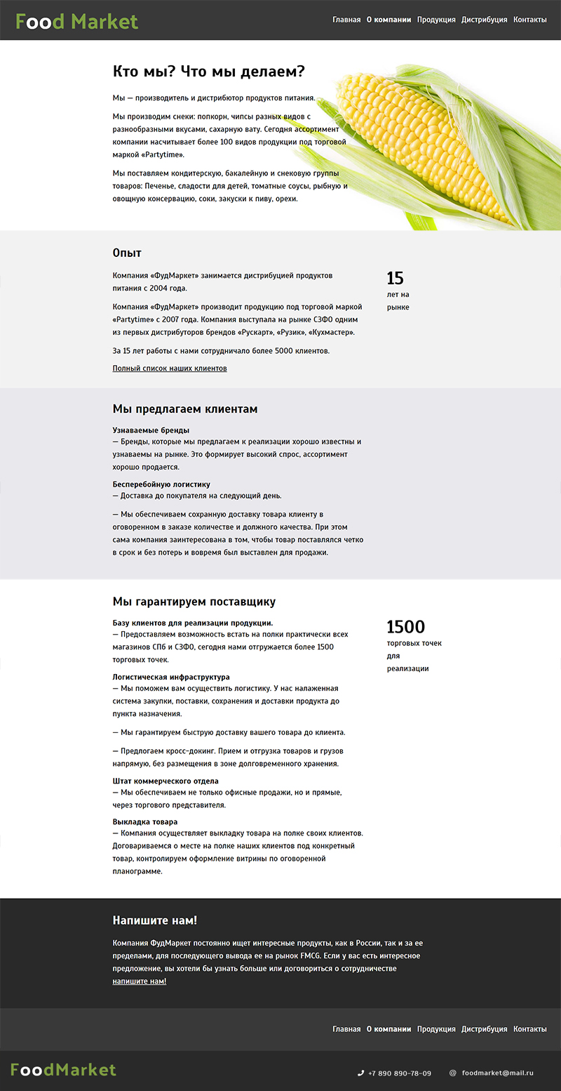
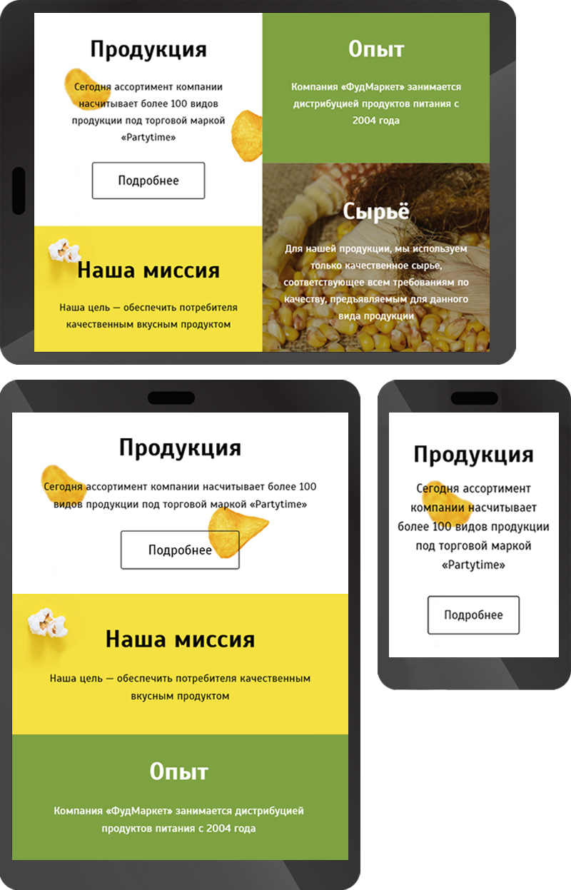
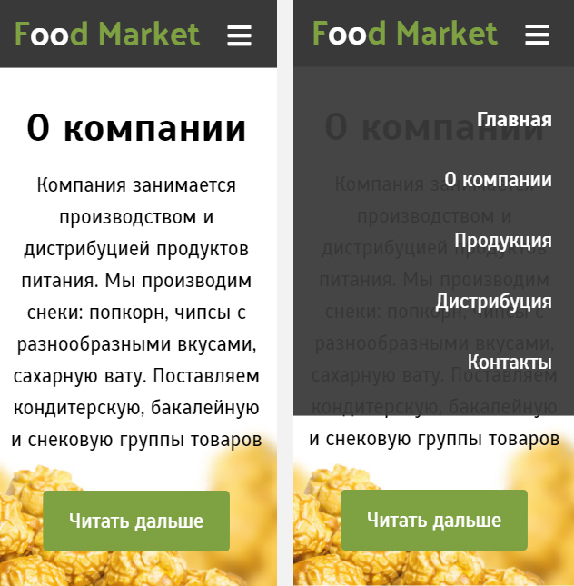
Foodmarket
http://fmarket.spb.ru/
Objective. Present company's services in the Internet. Provide information about the company for clients, casual visitors, or potential suppliers. Strengthen company's image.
About company. The company produces and distributes food products. Makes snacks, distributes snacks, sweets and groceries.