

Portfolio
Design school
Storage
About me
LinkedIn
Facebook
Instagram
zoia.bilash@gmail.com
Study projects
From May to October 2020, I studied at the Gorbunov Bureau School of Designers. On the first step, we studied theory. On the second, we did practical tasks: created web pages, information products, wrote articles.
On the second stage, teachers and supervisors of the school put grades and gave brief comments on the students' works. There was a time limit. Four working days were given to develop the first version of the layout, four working days for revision and preparing second version. I will show both versions and explain what I did to fine-tune the first version.
My school graduation page:
https://bureau.ru/school/designers/11/
Works on the first and second stage of the school:
Test assignment
1st stage coursework
Layout principles. "About me" web page
Website design. Redesign of the website about felt boots
Layout of a multi-level web page
Selling page. Home surveillance camera presentation
Test assignment
Objective. Design a basic scenario for buying a train ticket for a mobile application. Save passenger time and comply with the requirements of the Ministry of Transport.
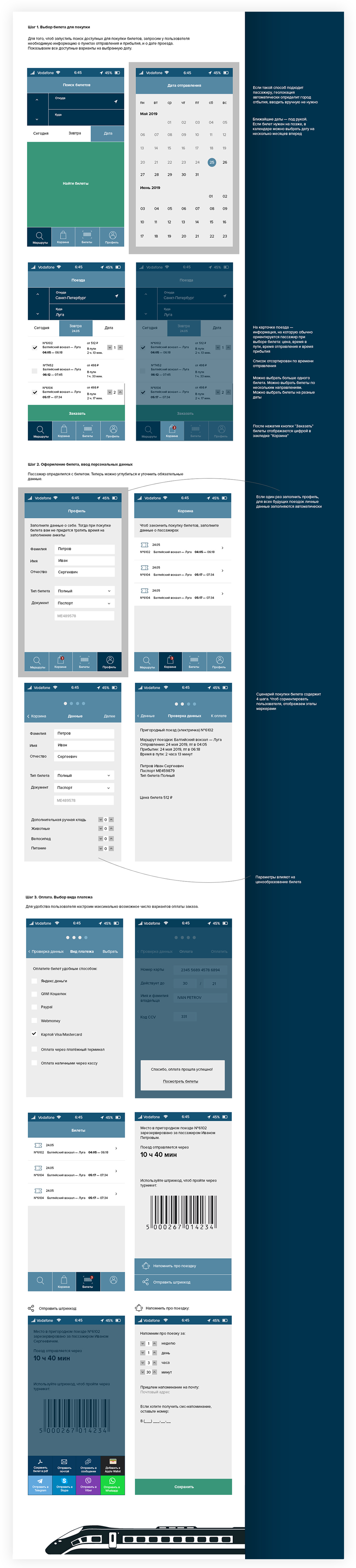
1st stage coursework
Teacher. Ilya Birman
Objective. Design a site "Pi" for ordering pizza at home and at the office. There are seven types of pizzas on the menu, some of them have a choice of toppings. Show at least three screens: pizza menu, topping setting and ordering process.
Solution. We are used to the fact that pizzas on websites are lined up monotonously on the page. The pizzas in the matrix are small, they look similar, you can't see them clearly. I arrange pizzas in unpredictable manner, make cards differ in sizes. The eye is not bored, the page is interesting to look at, you can see pizza in detail.
The pizza constructor adjusts to the filter. We will offer vegan some vegan cheese and meat. The form remembers the data, it is easy to return for a new pizza. You can track progress on the page, from the acceptance of the order by the pizzeria to the departure of the courier.
Grade: 3,7
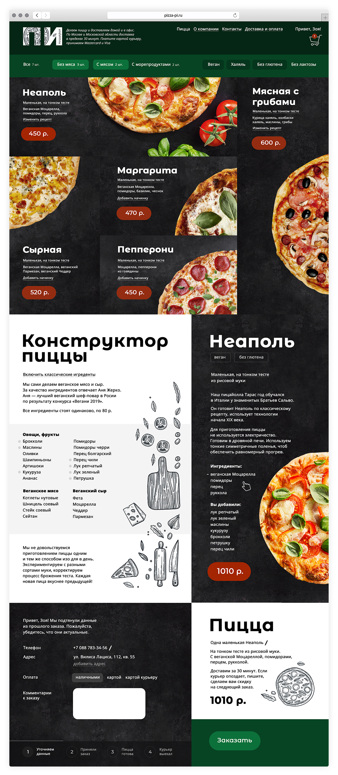
The coursework at the end of the 1st stage of Gorbunov Bureau School of Designers. Site "Pi" for ordering pizza at home and at the office
Layout principles. "About me" web page
Teacher. Mikhail Nozik
Objective. Make up a webpage about yourself. Content: photo, title, text, the rest is optional. Show version for desktop and mobile. Pages must fit on one screen.
First week. I used proximity theory, the rule of anchor objects. I made sure that the outer distances were greater than the inner ones, so that objects did not dangle on the page without being tied to power points.
I realized too late that there were no good pictures of myself for the webpage. I chose the best one from the archive on the phone.
In the first version, I got carried away with matching padding and lost sight of the boring square proportions of the web page.Grade: 3,5
Second week. On the second week I organized a photo session to get a good photo.
Moved away from the boring square format. Tried to make the layout more expressive by changing the proportions of the page. Designed the page horizontally on the screen, vertically in the mobile version.
I took a closer look at the text. I made sure that the line spacing does not argue with the word spacing, removed the dangling prepositions.
Grade: 4,4
Comment. The webpage looks simple. At first glance, it seems that designing such a page is a matter of minutes. In fact, in order to make up the final page, I had to go through several dozen options, spend hours and even days choosing the optimal ratios of distances and proportions of objects. It seems I learned a lot: to always take into account the format, pay attention to details, not to make random decisions.
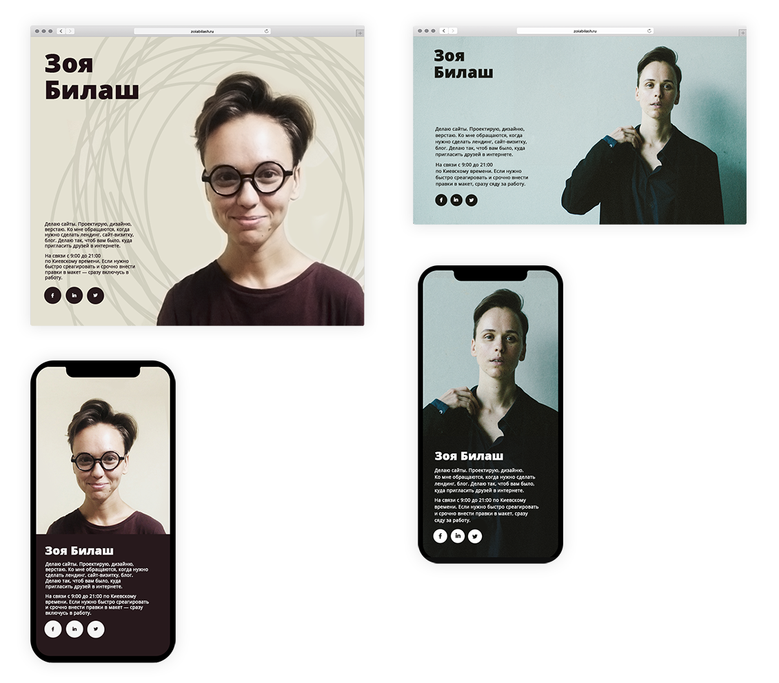
Layout principles. "About me" web page. 1 iteration is on the left. Got a lower grade for boring square proportions of the webpage, poor photo quality. 2 iteration is on the right. Organized photo session, moved away from the boring square format
Website design. Redesign of the website about felt boots
Teacher. Ilya Birman
Objective. Make a redesign of a website about felt boots. Make up its structure, show any page of your choice. The client wants people to better understand how high-quality modern felt boots look like, what they are good for and how to choose them.
Old design:
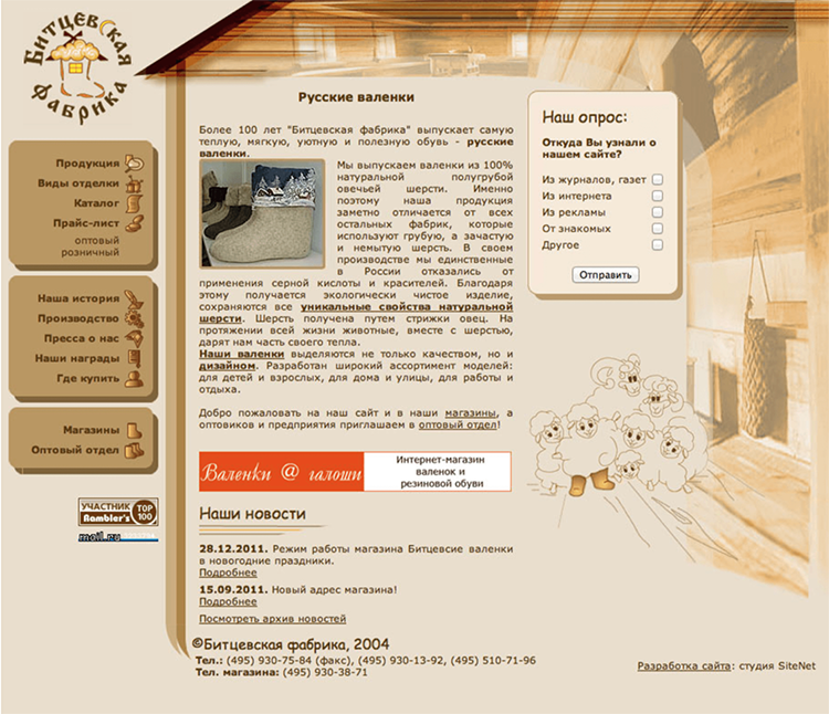
Old version of website design. A piece of work to be done — redesign the website, its structure and appearance
First week. I assumed it makes no sense to talk about how good the boots are. It is better to show it, to appeal to emotions of the consumer. Nobody doubts that felt boots are beautiful he sees them on the legs of a beautiful model.
Grade: 4
Second week. Made the location of price tags more predictable: aligned them to the sides of the screen.
Removed the noisy gray bar at the bottom of the page.
I tried to diversify the typography. I chose a more expressive font for the price tags. I found old catalogs with collections of woolen things in the storage. They used monospaced font, so did I. I used a serif font of similar proportions for the headings.
Grade: 4,3
Redesign of the website about felt boots. 1 iteration is on the left. 2 iteration is on the right. I changed a few things: typography, location of price tags
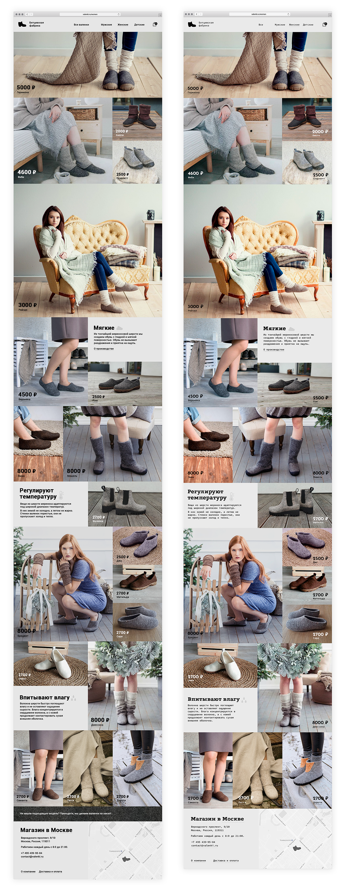
Layout of a multi-level web page
Teacher. Mikhail Nozik
Objective. "Vyazan" is a factory in Ryazan that produces knitted goods. They produce knitted items from sheep's wool. Earlier this week, there was a note about an outbreak of allergic reactions to wool items. Correspondents report a new strain of sheep flu that is causing this potentially fatal allergy. The head of "Vyazan" fears that the scandal will kill his business. "Vyazan" has a website. Put together a page for this site that will help reduce the effect of the Great Wool Panic.
First week. I wanted the page to have character. So that it was impossible to simply replace the title and immediately lose sight of the topic of the article. I picked up a distinctive font and details.
To diversify the rhythm of the page I used: a modular grid, multi-column layout, images, factoids, comments in the margins, “shouting”.
Grade: 3,7
Second week. First screen. Added air to the title. Moved the woolen ball to the left so that it took the anchor position.
Second screen. To fix the unfortunate combination of two color screens, I moved the second one below, where it serves as a cut-in. Added a title to the section to make it easier to navigate the page.
Third screen. Corrected paddings on the page so that the distances to the left and to the right to the pictures were equal. I redesigned the block so that the pictures did not hang between the edge of the section and the title. To make it obvious that they belong to the sections below.
Fourth screen. I pulled up the headline to the photo of the sheep.
Generally. Removed excessive decor. I took a closer look at the text. I made sure that prepositions do not hang at the end of the line. This way the text looks more tidy.
Grage: 4,5
Comment. I did a lot for the first time to accomplish this assignment. I wrote and edited the text for the article, made up the article layout. The work taught me to be attentive to the text, to think carefully about the reader and his needs.
Layout of a multi-level web page. 1 iteration is on the left. I got lower grade for excessive decoration, unbalanced paddings. 2 iteration is on the right
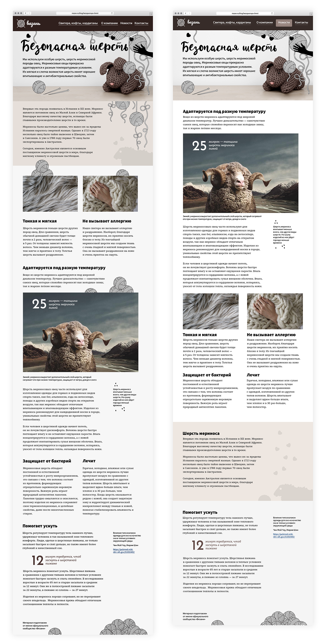
Selling page. Home surveillance camera presentation
Teacher. Maxim Ilyahov
Objective. Prepare a landing page for a home security camera. The camera looks like a figurine in the shape of a cat with a raised paw. The statuette is placed in a prominent place in the house, and it observes everything that happens, recording everything on a huge terabyte hard drive.
You need to come up with a product name that will please the Russian ear. Design a promotion page for this camera and a promotion mailing for anyone who is interested in cameras and home electronics.
First week. I used the following algorithm for constructing a promo page. The first screen: we show and name the product, designate its value foe the customer. The main part: we illustrate how the how the product makes the customer's life easier, helps to have fun, or get rid of his problems. Final part: the deal. We show the product and components, name the price.
Grade: 4
Second week. Added a section "Keeps you informed", where she showed more examples of how the owners see the apartment on their devices when they are outside at work or travel.
Added the "Sees everything" section. In the section I told more about what part of the apartment the owner sees in the video, what is the camera's viewing angle.
Redesigned the mailing, taking into account the possible limitations of the mobile phone.
Grade: 4,8
Selling page. Home surveillance camera presentation. 1 iteration is on the left. 2 iteration is on the right. Added sections to inform customer about camera's advantages, redesigned the mailing, taking into account the possible limitations of the mobile phone